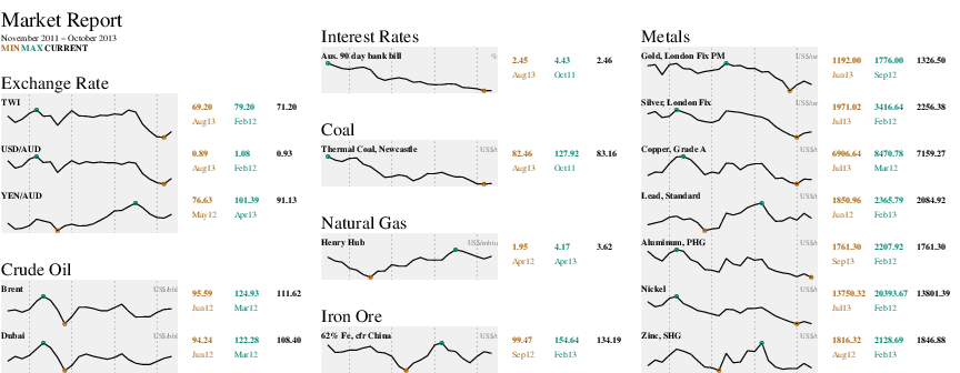
Inspired by Tufte’s sparklines I prototyped the following data visualisation at work today. A definition of sparklines given by Tutfe:
A sparkline is a small intense, simple, word-sized graphic with typographic resolution. Sparklines mean that graphics are no longer cartoonish special occasions with captions and boxes, but rather sparkline graphic can be everywhere a word or number can be: embedded in a sentence, table, headline, map, spreadsheet, graphic.
The Yale Toolkit on CRAN provides an implementaion of sparklines, but since it is not easy for me to retrive and install packages at work, I thought I’d roll my own (thanks to KM for the discussion on some of the visual aspects). Although not quite word-size …

R code for this image on Github and pdf version of the image is also available.
NB: The data from work has been replaced with publically available series from the RBA and IndexMundi.
The last element that was add to the graphic was the gray background on the plots which made an enormous amount of difference, surprising the crap out of me. I knew it would make a difference – helping to visually group elements and graph reading in general – but the improvement still surprised.